Contact

visit our website @ http://perspectivesinteriordesigns.com

Tuesday, October 30, 2012

Planned Renovations

Have you been thinking about a remodeling project?  These days many families are choosing to invest in their existing homes rather than building or buying new. There are many reasons for this trend but the ones we hear most often are about heart.

One client 'June' called because she needed a main floor Master Suite. Her husband had mobility issues. This meant he needed to minimize his use of stairs and seriously needed a walk in shower. June wanted to stay in her home.  She loves her location, loves her neighbors  and did not want to abandon her beautiful garden which had taken her 15 years to perfect. She first called to ask if we could come and see if it was even possible to do what she was thinking.  What she had thought of doing wasn't really feasible but we were able to show her a way to meet her goals, honor a budget and improve the value of her property.  In fact, we were able to space plan her new Master so the primary view was of her beloved gardens.

Our client 'Andy'  called because she had a major plumbing issue. The quotes to fix the problem were substantial . When first she called it was to say she was simply  not going to spend that huge sum of money in a bathroom she had never liked!
If she was going to have that sort of disruption she
wanted the long desired heated stone floors, deep soaking tub and a vista.   In this particular instance we not only gave her the bathroom of her dreams, we actually  did a renovation plan which  both moved and expanded the bathroom in a way which brought it into this millennium. Andy now has dual sinks, a separate shower,  and linen storage  to go with her her new soaking tub, heated floors and fabulous view. Had she just done what the plumber recommended, she would have  never had the bath of her dreams.

Do you know how this works? Sometimes a family will have an idea about a renovation or remodeling project. They do a search, call 2 or 3 contractors to come and see if what they are thinking is feasible. A contractor evaluates from the professional viewpoint
of  can it be built?  For those of us who have a professional practice offering space planning and interior design services we start at a different point.  Is this the best option? Does it improve function , aesthetics, flow, resale? Is there a better approach to reach all the objectives  within the budget? Not just can it be done but is it the best that can be done? A contractor is credentialed to build, not design.  Designers and space planners are credentialed to plan space for maximum benefit and to infuse that space with style. 

How do we do this? It is a process. It starts with listening to your ideas , evaluating your architecture, your design style, you budget and making a plan. We do drawings!  You must have the correct space  before you place anything into that space.

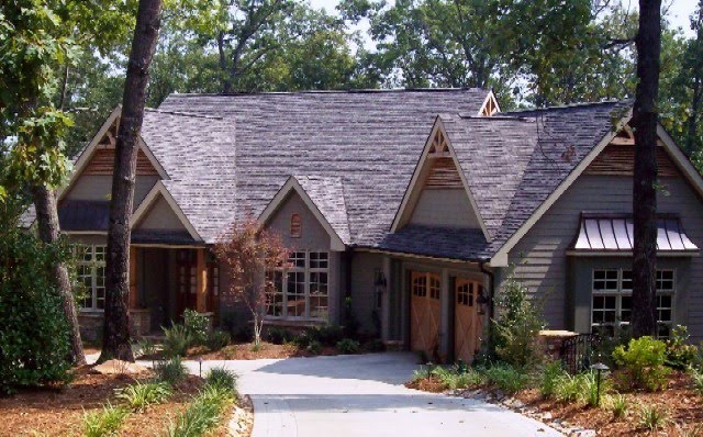
Right now, on Keowee,  there are many houses with fabulous views and grounds for sale. Bargain prices abound. However,  quite a few of these houses are dated but can be renovated without the price per square foot exceeding prudence. Often these homes have floorplans with  isolated Kitchens, all the Bedrooms are  either up  narrow stairs or down steep stairs.  Many are plagued with beautiful rooms which are never used because they are at the front and the view is at the back! Decks are narrow, Porches are cramped, Bathrooms are ...  functional . We don't even need to talk about old carpets, wallpaper and tile counter tops  do we?  If the price, the view, the grounds are right for you, chances are we can renovate the house to make your biggest dreams come true.

Not long ago we updated  'Karen's' house.  We  took out just a portion of two walls, extended the kitchen, added texture to the fireplace wall, replaced all bath fixtures,  removed carpets, added hardwoods, paint and a few window dressings. Now, for the first time in a dozen years, Karen tells me every morning when she pads out to the Kitchen to make coffee she thinks, "I love my house!" .

Not long after Karen's renovations were complete she asked us to help her friend "Georgie" who had looked at purchasing a   1987 built house, off North Flagship,  which had never been updated. Georgie loved everything about the property except the house . She had assumed it would cost too much to " fix it"so hadn't made an offer.

We met on site with her realtor to discuss what worked for her needs and what did not. To her absolute delight we were able to show her how a few inexpensive changes solved all the space planning problems and everything else was just cosmetics. Georgie bought the house.  When she is entertaining on the Porch, she  reflects on having walked away from this dream  because she just had not been able to  recognize it was there.

If you have a dream for your home which has not been realized,  give us a call. Our services are listed on this blog pages right side column as are our e-mail address and phone number.  Don't be shy:

 keoweedesigner@gmail.com
 or
www.perspectivesinteriordesigns.com


Friday, September 14, 2012

The Non-Compete Clause


Interior designers are dedicated advocates for creating  strong symbiosis between  architectural style and interior design style. Certainly there are ways to nudge those parameters a bit wider, but, in general, it is an excellent decision to edit  choices to those which reinforce the relationship between  architecture, design and environment.


Homeowners are usually clear about the look and feel they wish to achieve.  They don't always know the best path to their objective. In response to this query, designers often encourage clients to make a  commitment to what we call a "non-compete clause". Which simply means there is a greater chance of achieving the goal by   editing  existing possessions and, new acquisitions ,to those which enhance the architectural statement.


 Here in the mountain-lake region of upstate South Carolina we are blessed to have spectacular vistas out most every window. There is a  strong showing of  open floor plans in the Contemporary Craftsman architectural style. Most are more Craftsman "lodge" style than Craftsman "cottage" style.


There is  extensive use of natural materials: more stains than paints, more stone than tile, more hardwoods than carpet.There is also a common goal  to create a  spacious comfort rather than a cozy comfort.   To echo the expansiveness of the vistas.  To keep the interior decor open, uncluttered, muted, in order to " not compete" with the responses generated by soaring ceilings, wide open floor plans, huge expanses of glass and those ginormous vistas. 

One of the joys of being an interior designer is the opportunity to partner with families to achieve the home of their dreams. Sometimes new construction, sometimes remodeling, sometimes  for a new purchase. In all of these scenarios a "non-compete clause" is a good idea.  At design seminars we learn the most often stated reason for homeowners to contract design services is "  We know the look and feel we want for our home, we are not sure of the best way to achieve our goal". 
One of the most successful tools for achieving the defined objective, is careful  editing of existing     furnishings and wise selection of new furnishings. Realizing the  goal of symbiosis of design, architecture and environment is a fine reason for popping a cork.

Friday, August 24, 2012

"Less is More"

"Less is More"" is a famous quote in the professions of both architecture and design.
Often this quote is attributed to Frank Lloyd Wright when, in fact, it hails from his mentor, modernist architect Louis Henri Sullivan.

Mr Sullivan's idea is to meet all the criteria of function, design, style and not one thing more. To wisely and creatively refine designs as possible; sacrificing nothing and disallowing anything extraneous.

Recently we had a Keowee Key client with a big bold personality desiring her home to match. She was very clear about not wanting one of those
 " boring vanilla box houses". For her a big, bold colorful house was the design criteria.


 Since our practice is focused on design individuality we adore these projects. Sometimes, during the process of helping clients achieve the home of their dreams, we must carefully educate. With this client " less is more" was an alien concept. She wanted everything to be  big and bold. Everything. Every surface, every texture, every fabric, every color, every style,  every art piece, every rug, every accessory, every window treatment. One of the things that made this client such a joy to work with was her high energy and unbridled enthusiasm. She also is immediately attracted to all that glitters! This  instant attraction to dramatic materials created a significant challenge. Like many clients, she knew the look she wanted to achieve, but not how to get there by  denying herself that which she found attractive.  Balance can often be the tricky part of any art form and designing interiors is no exception.


Josef Frank , an Austrian born architect, is well known for the pillow fabric above.  Known as "Green Bird", this fabric as well as other Josef Frank classics are available at http://www.justscandanavian.com/
 It is an exciting,  fabric but it definitely is not a fabric to use in abundance.  We often use this particular fabric to demonstrate the  " less is more" concept.

In this larger graphic of the Green Bird textile  you can see the design shows a stream, a tree in bloom and  a flock of birds of several species with the Green Bird the focal.  A good amount of contrast and strong diagonal lines of the tree also add to the complexity of the print.

On this wing chair the curving furniture lines create distortion of the textile image. This  application creates a new level of complexity for an already complex textile design. Definitely a  case where less  would be more pleasing.


 When a design element can rightfully be described as art,
it is often best to use it to make an artful statement.

Green Bird  used as an upholstered headboard has about the same amount of fabric as the wing chair above. Used flat  the impact has clarity and reads  more  as a piece of functional art than just a nice upholstered headboard. Had this fabric also been used for the bedding, it would overwhelm. To my eye, the inability to center this strong diagonal pattern repeat disturbs. So in this application too, I want to see less.
In this last image the  Green Bird fabric is used to make a pair of valances.  While it is unfortunate these valances  were not fabricated with blackout lining, they still showcase the less is more concept pretty well.   The pattern is above eye level and is used wisely by minimizing pattern repeats. Can you imagine this room had the sofa been clad in Green Bird?
Once again Mr. Sullivan and Mr. Frank helped us  communicate an important concept to our client in a clear, visual format. Since this client is one of those rare individuals who can  successfully wear bold and graphic  clothing accompanied with large , colorful, plentiful jewelry  it was very important for her to understand the need for wise editing. Initially this client could not understand how she could boldly combine many strong components to her personal style and not apply the same approach to her home. Frank's "Green Bird" textile was the key to her understanding of  getting more impact with less confusion via jusdicious selection. Our fabulously bold and beautiful client does indeed have  the decor of her dreams. Throughout the project we  all maintained a strong awareness of  the " less is more" creed and were able to refine the design to the maximum finesse without sacrificing function or impact.

Our design services are listed on the sidebar.
We can be reached via: www.perspectivesinteriordesigns.com
or
keoweedesigner@gmail.com