Contact

visit our website @ http://perspectivesinteriordesigns.com

Wednesday, August 28, 2013

Adding To Your Life


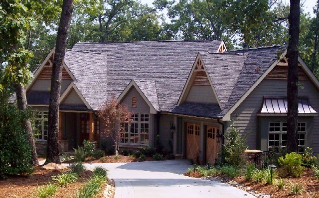
Last Spring,longtime friend and client Connie lamented over lunch  about not having a screened  porch on her Keowee lakefront home. When I asked her why she didn't add one she responded by saying several builders had told her there was no way to put a porch  where she wanted one because of her complex roof line.

" Sure you can", I said.

Just after Labor Day the selected contractor will begin her porch project. The journey from that lunch time conversation to her new reality was actually, pretty typical in the custom designing process for me. It has been the first of a lifetime  experience for Connie. Even clients who have had design services in the past may not have experienced the  extended process necessary for making an addition to a home. It  can be complex.

I would love to tell you I was able to smooth everything so successfully Connie had a stress free experience but this was not the reality. The process requires a lot of work on the part of the client.
Sequential decision making is necessary. It is true some clients say, "Just do it!" but most want to have a say in the  function, the style and the budget of their projects. Which means putting in the time
and the hard decision making is required. This sounds tough, I know but it is the truest path to a successful design that is yours.

It is a key responsibility of the designer to help the client identify the function, the style and the budget  for their projects.  Just yesterday I received an inquiry e-mail about our services. In that e-mail, the homeowner said,
"...my experience in the past with decorators is they have their own style or I have been unable to adequately communicate my preferences and I've ended up with rooms that are too formal/traditional for me."

Her lament is the very definition of  the differences between a decorator and a designer. A decorator does just that, styles (decorates) your home for a season or to reflect current trends. It is a lot like going to Talbot's or Chico's for their pros to "style" your personal look. There is a tremendous difference in having your home decorated in the latest home fashions and having one designed to meet your needs both functional and aesthetic.

Designers are educated in  creating volumetric art which  uses the elements of light, color, texture, scale, contrast, focal point and furnishings  to create an environment which reflects the interests, lifestyle and functional needs of the occupants which compliments the architecture and the views out every windows. We designers  bring the full comprehensive design process to every project of every scope and every budget.

With Connie, we broke the process out into stages.

 In the assessment stage, I came  to her home to
take field measurements, take photographs of her architecture from the rear, to analyze how a porch would look from the dock, to identify best views we wanted to capture and to determine the material use best suited to her contemporary architecture.

The most important part of this process was the interview to determine how the porch would be used. It sounds simple but Connie's needs included her daily enjoyment of her gorgeous location, and adequate space for dining and gathering for her frequent entertaining schedule. To my delight , we also discovered  she  loved the idea of having the perfect spot for  her grandchildren to experience Summer nights sleeping on a porch, watching the fire flies and the stars to the tunes of the hoot owls.

In the design stage we produced Plans "A" and "B" with both bird's eye views and elevations of how either plan  would  actually look on her house. The plans show options for a vaulted ceiling of either a hip or a gable style, a straight out  from the  main house  floor plan and the other  angled  to the long view up the lake. That long view was really, really nice but angling the Porch  visually dominated her architecture. We wanted a more cohesive statement so we choose the straight out floor plan and revised a furniture plan  angled  to capture the long view.

Once all the decisions have been made on the footprint and the materials, we produce design documents by which the projects are permittted,  bid and, built. A selected plan is   finalized with  an on site review of all the materials selected: woods, stone, screen, railing, roofing, lighting, skirting, stain, furnishings,  to give the client the best visual possible of what will be built and how it will look. Those series of decisions are necessary to make a project perfect. In some cases, clients are not good with conceptual space so for these folks we mark the outline of the floor plan onto the ground with marking paints or flags and tape.  It is always an emotional and a financial expense to add an addition to one's home so we do our best to help the client "see" what does not yet exist.  

Bidding out the project is actually pretty simple. Invite  2 or 3 good builders to come meet the home owners,  walk the site, review the plans. Encourage builders to bring their best crew and make any alternative recommendations they may have, before they bid, so those changes can be reflected in the bid.

The hard part for Connie was in choosing the builder! All good builders, with solid reputations,  reasonable timelines and competitive bids. When you like them all, the choice is hardest.

If you are considering adding to your life, not just  to your house, then do  prepare for a positive experience by choosing those professionals who can best guide you in attaining your goal  in a way which will reward you with a "happily ever after". If you would like our assistance in reaching this goal please e-mail us, we will be happy to respond.


Friday, April 5, 2013

Motivations

One of the more interesting aspects of the design business is what motivates clients. There are two broad categories which induce clients to commit to a project. Need and desire.  The need for improved function or safety are the top two. If you can no longer step over the side of a tub to take a shower then you actually do need a walk in shower.  If your home has no main level master,  you can no longer navigate stairs and, you cannot sell your house in a dead market then,   a way to get to other floors or a way to live on the main floor is a functional reality. We have solved these issues , and others, many times over. There is always a solution even when it seems otherwise.

While we do find creative problem solving to address a functional
reality exciting;  to creative problem solve  something as winsome as a desire or a feeling is a rush!  I once had a woman come into
the design studio sans an appointment,  carrying a  vintage pitcher from a favorite Aunt. What she said was, " I want to feel in my Kitchen what I felt in my Aunt's Kitchen.
She loved this old pitcher and so do I"


As designers we cannot return your Aunt to the Kitchen.  Often,  with an object like this vintage Villerory and Boch pitcher, a good conversation and, maybe a picture or two , we can create the desired  feeling of comfort and love.  In this case what was needed was not a change of layout but a change of finishes. We were able to paint cabinets, replace  hardware and lighting, update the countertops and splurge on a beautiful blue enamel  Viking dual fuel range.

Their appliances had been in need of replacing for some time. Unfortunately She and her husband had been unable to agree on the type of appliances or the finish. He wanted an indoor gas " grille worthy" stove in  stainless  while
she was a baker hoping for commercial ovens and a new  panel front refrigerator to blend in with the cabinetry.  The surprise of the dual fuel
blue range with the stainless top solved the problem ! The burners and grilles are gas, the ovens electric or convection. The new counter
depth stainless refrigerator provided the needed clearance for the mobile island they both wanted. We all  agreed to a concealed dishwasher.  The result was not just happy home owners with a beautiful ,professional, efficient Kitchen but, more importantly, a client who awakes every morning to the feeling of well  being she experienced in her Aunt's Kitchen. I still feel lucky she walked into our design  studio!


A few years back we had clients with a home under construction in Acadia.  They had bought the home  from a contractor who was building it as a spec house. At the time of purchase the slab was poured, structural materials had been ordered and there were blueprints. I phone call from the site, " We bought a house! Come see!" resulted in a Sunday afternoon delight. The timing was perfect for making changes to the floor plan; expanding a porch and adding an outdoor Kitchen. Once we began the process of working with the builder in selecting finishes and fixtures the Mrs. said, "There are some light fixtures from my family home I would like to use if we could." A field trip to  the family homestead where she and her  seven siblings were raised  resulted in the rescue of a pair of vintage silver chandeliers. Quite beautiful fixtures which we were able to send out to be refinished and re-wired. We also worked with the cabinet makers to create a built-in  sideboard in the passage between Kitchen and Dining on which we showcased her mother's collection of silver serving pieces.  The delight in this project was not just the ground floor opportunity to address the floor plan, the finishes, fixtures and  furnishings. Or even great clients who were a joy from beginning to completion.  There was great  creative satisfaction in  combining  space planning and design services  to meet  this family's functional and aesthetic needs. Having the opportunity to incorporate meaningful  family heirlooms into a perfectly functioning, beautiful and nurturing home was an additional honor.

Just today I received an E-mail from a  Keowee Key client for whom we have done some renovation plans and installations. She is recently retired and still adjusting to being at home.
While she and her husband remain busy with interests in sports, music and volunteering, they
are not accustomed to the many hours at home together. Both achieved successful careers and were acclimated to private offices, decision making and autonomy.  At home, sharing an office has been problematic, resulting in one in the office and the other on a laptop in the Sunroom.
 Today was the day the Mrs. recognized the office was "his" not "theirs" and  sent an e-mail asking, "do you think I could have an office upstairs?"  I responded, "a woman who has lived with all males for 40 something years  (1 husband, 4 sons) has surely earned  a room of her own!"

 In truth we often see clients who do not use a third or more of their homes because it is reserved for guests. That is fine if you do not need the space for your own use. We encourage our clients to enjoy their homes! Unused, empty rooms are not a good thing. I will do my best to motivate this wonderful woman to allow herself to be as important as sometime guests.  That she will in fact choose to have an entire room dedicated to her. Not just a desk  tucked into a corner.

Motivations  can be as random as a beautiful Spring dogwood bloom or  the return of the bugs.
Today Penelope called to say, " I need a Porch! I am not spending another summer on Jocassee with these bugs!"

Thursday, February 28, 2013

The Art Conundrum

andecookstudio.com
 Lately, I have had a series of consults regarding art. Many clients are of the belief they must be wily as a fox to divine the perfect art  for their homes. I am not sure why so many people find art to be the most intimidating part of their design but, they do. I hear more anxiety expressed about art than any other element of design.

If the clients are art collectors they are requesting  counsel on how best to display the art. Sometimes, to my absolute joy, they want to use art  as the inspiration  for a room design. I love these projects! More often there are clients who are not collectors, have never bought  original art and are uncomfortable with even the idea of looking for art to enhance or balance a room.


Art lovers buy art because they experience an emotional response to the image  or movement or colours. Sometimes the mood and colors are compatible with the decor but often, this is not the case. These clients mostly need us to help them  edit out of their decor those objects, patterns, or colors which detract from the art.  Conversely, we also  have  clients with absolutely no interest in art! The governing  belief  here is art is a necessary "filler" to be purchased to match their design palette and style.

These clients take a good bit of shepherding to avoid the furniture store look. Often we are successful in directing these clients toward art which is related to an interest, hobby or location.

One client now has a colorful , (inexpensive) collection of  vintage travel posters reflecting his love of travel to ancient cities and cultures. He reports his dinner conversations are now more interesting than ever before because his guests have either visited some of the locations or yearn to.

 In the same way I hear the most anxiety about art I also see the most "mistakes" in the  presentation of  art. Most often the issue is the scale or the framing style or, the other items in the space which do not peacefully coexisit with the main art piece.  These are all pretty easily corrected. In the selection of art there really is not a list of "right" or "wrong".  I have many suggestions for art selection but only one rule. Which is,  if you are going to see it every day for the rest of your life, you should like it!

Jan had us work on her mountain home while she was in Florida. She had mentioned there was a variety or art and objects stored in her basement we could draw from. While searching her basement I found a signed Dali canvas! I called her and  asked why on Earth she had a valuable art piece in her store room? She explained her husband  had acquired it via a low silent bid at a charity auction in New York  decades ago.  Jan  had never liked the piece and did not want to look at it! We talked to her husband and shipped the canvas to Christie's  to be sold.


Cherokee Foothills Scenic Highway
In newer open plan homes with soaring ceilings , huge spaces and expansive glass walls; getting the scale of the art correct is essential.  If you have a spectacular view from every window this is your primary art.  The palette is colorful, the scale enormous, the impact  immeasurable. Refraining from competing with art by God is always a good idea!


We often recommend to clients,
with these beautiful vistas,
we extrapolate their color palette from the view.
I have stood on many a deck holding up color cards to match the water, the sky, a sunset, a flowering tree.  It is often a beautiful marriage to select artwork which looks as if it has been extrapolated from the view.  While it is true the view is the dominant art during the day, during the prime "entertaining hours" darkness has cloaked the view.


Using architectural dimension or texture  to merge the feel of interior to exterior spaces is another way to incorporate what we call "volumetric art"  into a space.  Many people understand this in a themed architectural style like you see in log homes or Tudor designs. But, for some reason there is a resistance to adding architectural detailing to a new construction home of no particular architectural style.  Truthfully, there really is not a lot of excitement  with just drywall, crown moulding, door casings, baseboards and paint . A large empty wall , especially a two story wall,  cannot  gain interest from art alone.  A very large piece can dominate the space while a collection of small art can make it too busy-busy at  eye level and empty above.


If your home is graced with architectural detail, this too is  often the  art.  Suzanne and I spent hours designing windows, doors, paneling to make the welcoming statement she wanted for her Waterford home on Lake Keowee. Because her core is light filled  and high volume, with stairs going to both the penthouse level and the lake level, we wanted the play of light and shadow to introduce the feel of the house. We painted trims, walls, ceilings with white, high gloss oil.
Architectural detailing IS  art
We contrasted this with staining the floors, front door, stair treads and handrail in a rich chestnut finish. We encouraged this family to refrain from adding  framed art within the paneling, allowing the architectural detailing to be the art. They have been in their home for about two years and remain  pleased with this decision.

 Another of our clients has a "feature" wall in her
main gathering room. There are built-in bookcases flanking a fireplace. Above the mantle there is a soaring, two story slab of vanilla drywall. Their five year search has not been successful in solving their art conundrum . On my first visit to their home they escorted me into the space, pointed to this "feature wall"  and said, "Help!"  Theirs is a common problem of  scale and balance.  In this particular case the issue is magnified by the fireplace wall being taller than the room is wide. To add a cladding material like wood, brick or stone would result in an undesired visual heaviness. Because the fireplace is flanked by bookcases, a collection of anything  gets too busy. One massive art piece would overwhelm the feature of the bookcases and the fireplace. What was needed was an architectural solution not a decorative solution.  We have designed a  lightly scaled architectural over-mantle design with a low contrast finish  into which we incorporated an  arts and crafts style, stained glass window panel.


Frank Gee.com
Our client Leyda has colorful South American roots. For her there is no such thing as too much color. For her more conservative husband, a vibrantly colored  house in the mountains is  undesirable. Or to quote him, " I do not want a house which looks like it should be on Sesame Street".
The solution for this family was to paint the walls a natural linen color, fabricate drapes to match the wall color,  and to upholster the seating in a variety of heavy woven, solid colored,  textural linens. Next we searched for over sized, vibrantly colored canvases to anchor the main rooms. Whenever possible we borrow art "on approval" to try on site before finalizing purchases. Once we accept a painting as being THE piece for the room ,we begin giving depth to the designs by the selection and placement of rugs, accent textiles and objects. One necessary component of this contemporized design approach is the need for live plants or trees. For our clients who do not have green thumbs or who are seasonal residents we recommend the use of services for rotating or maintaining  the plants. We never recommend artificial plants. Never.

Art is one of the great presents of life.
Don't deprive yourselves of  this joy.
If you have a need for solving an art conundrum in your home, schedule  a consult!
We can be reached via:
  keoweedesigner@gmail.com


Wednesday, January 30, 2013

Show Your Stuff!

Recently I met a woman who, like many of our clients, knew exactly the 'feel' she wanted for her home but did not  quite know how to accomplish this goal. She had the basics in place but was experiencing a challenge in " pulling it all together".
 Like many homeowners past the half century mark, she had first learned how to furnish and decorate her homes before "open concept" floor plans were the norm. She knew how to establish a rooms statement back when Foyer, Living Room, Dining Room, Kitchen, Breakfast Room and Porch were not all openly visible standing 3 feet inside the front door. There was a color  flow  punctuated with individuality by room.

This charming lady, "Lilli" explained her pleasure in her beautiful Lake Keowee home was marred by her frustration with "getting the  right feel".  She actually did have great "bones" in place but beyond that there were issues. Her decor was sterile, impersonal and incomplete. The opposite of this gregarious, accomplished, interesting woman. Like many new construction homes, all the paint  in the  house core was a single color. Her built-in casework flanking her Great Room  fireplace were the same as the Kitchen cabinetry, Island and Bar. Hardwood floor throughout and lighting from a single "collection". All excellent quality and, very boring. What I sometimes think of as
" high end generic".

As it turns out, Lilli had 90% of everything she needed to  pull her look together. It was all stored in her pantry!  While I was taking photos and examining spaces I encountered a large collection of copper pots and pans, some beautiful white on white china and a good sized library on French cooking.  I learned she had spent time at a French cuisine focused  cooking school for "executive wives"   back in the 80's. She went on to explain she  had loved  the experience which had led to family vacations in France and a  deep appreciation of all things French.

This conversation, following the discovery of the copper,                           became the inspiration for her interior design.                                                                                                                                                               In the kitchen wall cabinets with glass doors we painted the interior back walls a deep terra cotta color  as the perfect background for displaying her French   creamware collection. We  had an artisan blacksmith in Greenville fabricate a  wall mounted pot rack for showcasing her copper cookware which we installed between Kitchen and Breakfast areas. 

 Her Kitchen Island was upgraded with a marble top for pastry preparations and we bought a fabulous vintage french chandelier from a restorer, also in nearby Greenville. We recovered bar stool seats with aged seed bags, lettered in French, which Lilli had bought from a road side vendor in Provence.  We sent  these out to be  teflon coated for durability. We displayed many  of her cookbooks and most of her smallish collection of vintage marble rolling pins.

In her Great Room we  revised the below counter level cabinet doors to glass fronted, added interior cabinet lighting, and used this space to showcase her husband's collection of decoys. To the upper,  open shelving, sections of these fireplace flanking built-ins we added "aged" mirror to the backs to bring light and life  to this side of the room. We incorporated  copper planters, sculptures,  French collectibles and  some family photos into the mix of books, cd's and dvd's so each shelf made an eye appealing "still life".
We  painted the Dining Room ceiling a dramatic color and softened the room by adding drapery side panels on a heavy wrought iron rod with rings. We took the upper section of her china cabinet off the base creating a wonderful sideboard. Above this we hung a huge, but inexpensive , painting of village life in France. On the "new" sideboard we  displayed her heritage collection of pewter candlesticks, some more copper pieces and her collection of live orchids because the Dining Room light was perfect for this botanical.

Lilli went through old carousels of slides taken during family vacations in France. From these we extracted a few, took them to be enlarged as closeups of architectural elements of column capitals, frescoes, gargoyles  and  window boxes. Those elements which, to Lilli, are the essence of French architecture.  We had these framed  with common matting   then selected framing choices of similar finishes, but with a variety of profiles, to make the   photo collage more substantial in scale. As is true with many open floor plans, this Foyer wall is the "focal"  view for half the guests seated at the Dining table. This personal story collage works well as a uniting element of both spaces. And, I am told, often the genesis of great conversations.                                                                                                                                                                              I notice, with each successive visit to Lilli's home, more and more of her family interests  are making their way into the decor. This is exactly what design is meant to be:  a catalyst for personal expression through decor. 
If I am doing set design then I expect there to be few, if any, changes.  If we are designing a model home we strive to make it look anything but staged. We expect little change to the design we install as no actual person lives there. The purpose of a model  design is to showcase the possibilities  of life herein.  The purpose for a home design is to showcase the residents  life within.

When  design professionals are contracted for  residential design it is vitally important the finish product reflect the residents not the designer.  I do not live in Lilli's house!  It should reflect her family, her interests, her life.  Not mine. I actually tell my clients the name for my profession is " interior designer" not "interior dictator". Lilli tells me she is entertaining more, cooking more, enjoying her home more. She tells me because of the new French interests and collections on display her gatherings often are infused with great sharing of travels, cultures, cuisines,  and wines. She even called recently to say her book club was meeting regularly at her house and were currently  passing around one of her  books because she  had mentioned, " one of the best things I ever read was this cookbook". She laughingly said, " I didn't know you were creating an  interactive  design!"  I told her if she gets around to organizing a cooking class to sign me up!

Our design services are listed on the sidebar.
You can reach us via:
 keoweedesigner@gmail.com
or: 
www.perspectivesinteriordesigns.com


Tuesday, October 30, 2012

Planned Renovations

Have you been thinking about a remodeling project?  These days many families are choosing to invest in their existing homes rather than building or buying new. There are many reasons for this trend but the ones we hear most often are about heart.

One client 'June' called because she needed a main floor Master Suite. Her husband had mobility issues. This meant he needed to minimize his use of stairs and seriously needed a walk in shower. June wanted to stay in her home.  She loves her location, loves her neighbors  and did not want to abandon her beautiful garden which had taken her 15 years to perfect. She first called to ask if we could come and see if it was even possible to do what she was thinking.  What she had thought of doing wasn't really feasible but we were able to show her a way to meet her goals, honor a budget and improve the value of her property.  In fact, we were able to space plan her new Master so the primary view was of her beloved gardens.

Our client 'Andy'  called because she had a major plumbing issue. The quotes to fix the problem were substantial . When first she called it was to say she was simply  not going to spend that huge sum of money in a bathroom she had never liked!
If she was going to have that sort of disruption she
wanted the long desired heated stone floors, deep soaking tub and a vista.   In this particular instance we not only gave her the bathroom of her dreams, we actually  did a renovation plan which  both moved and expanded the bathroom in a way which brought it into this millennium. Andy now has dual sinks, a separate shower,  and linen storage  to go with her her new soaking tub, heated floors and fabulous view. Had she just done what the plumber recommended, she would have  never had the bath of her dreams.

Do you know how this works? Sometimes a family will have an idea about a renovation or remodeling project. They do a search, call 2 or 3 contractors to come and see if what they are thinking is feasible. A contractor evaluates from the professional viewpoint
of  can it be built?  For those of us who have a professional practice offering space planning and interior design services we start at a different point.  Is this the best option? Does it improve function , aesthetics, flow, resale? Is there a better approach to reach all the objectives  within the budget? Not just can it be done but is it the best that can be done? A contractor is credentialed to build, not design.  Designers and space planners are credentialed to plan space for maximum benefit and to infuse that space with style. 

How do we do this? It is a process. It starts with listening to your ideas , evaluating your architecture, your design style, you budget and making a plan. We do drawings!  You must have the correct space  before you place anything into that space.

Right now, on Keowee,  there are many houses with fabulous views and grounds for sale. Bargain prices abound. However,  quite a few of these houses are dated but can be renovated without the price per square foot exceeding prudence. Often these homes have floorplans with  isolated Kitchens, all the Bedrooms are  either up  narrow stairs or down steep stairs.  Many are plagued with beautiful rooms which are never used because they are at the front and the view is at the back! Decks are narrow, Porches are cramped, Bathrooms are ...  functional . We don't even need to talk about old carpets, wallpaper and tile counter tops  do we?  If the price, the view, the grounds are right for you, chances are we can renovate the house to make your biggest dreams come true.

Not long ago we updated  'Karen's' house.  We  took out just a portion of two walls, extended the kitchen, added texture to the fireplace wall, replaced all bath fixtures,  removed carpets, added hardwoods, paint and a few window dressings. Now, for the first time in a dozen years, Karen tells me every morning when she pads out to the Kitchen to make coffee she thinks, "I love my house!" .

Not long after Karen's renovations were complete she asked us to help her friend "Georgie" who had looked at purchasing a   1987 built house, off North Flagship,  which had never been updated. Georgie loved everything about the property except the house . She had assumed it would cost too much to " fix it"so hadn't made an offer.

We met on site with her realtor to discuss what worked for her needs and what did not. To her absolute delight we were able to show her how a few inexpensive changes solved all the space planning problems and everything else was just cosmetics. Georgie bought the house.  When she is entertaining on the Porch, she  reflects on having walked away from this dream  because she just had not been able to  recognize it was there.

If you have a dream for your home which has not been realized,  give us a call. Our services are listed on this blog pages right side column as are our e-mail address and phone number.  Don't be shy:

 keoweedesigner@gmail.com
 or
www.perspectivesinteriordesigns.com


Friday, September 14, 2012

The Non-Compete Clause


Interior designers are dedicated advocates for creating  strong symbiosis between  architectural style and interior design style. Certainly there are ways to nudge those parameters a bit wider, but, in general, it is an excellent decision to edit  choices to those which reinforce the relationship between  architecture, design and environment.


Homeowners are usually clear about the look and feel they wish to achieve.  They don't always know the best path to their objective. In response to this query, designers often encourage clients to make a  commitment to what we call a "non-compete clause". Which simply means there is a greater chance of achieving the goal by   editing  existing possessions and, new acquisitions ,to those which enhance the architectural statement.


 Here in the mountain-lake region of upstate South Carolina we are blessed to have spectacular vistas out most every window. There is a  strong showing of  open floor plans in the Contemporary Craftsman architectural style. Most are more Craftsman "lodge" style than Craftsman "cottage" style.


There is  extensive use of natural materials: more stains than paints, more stone than tile, more hardwoods than carpet.There is also a common goal  to create a  spacious comfort rather than a cozy comfort.   To echo the expansiveness of the vistas.  To keep the interior decor open, uncluttered, muted, in order to " not compete" with the responses generated by soaring ceilings, wide open floor plans, huge expanses of glass and those ginormous vistas. 

One of the joys of being an interior designer is the opportunity to partner with families to achieve the home of their dreams. Sometimes new construction, sometimes remodeling, sometimes  for a new purchase. In all of these scenarios a "non-compete clause" is a good idea.  At design seminars we learn the most often stated reason for homeowners to contract design services is "  We know the look and feel we want for our home, we are not sure of the best way to achieve our goal". 
One of the most successful tools for achieving the defined objective, is careful  editing of existing     furnishings and wise selection of new furnishings. Realizing the  goal of symbiosis of design, architecture and environment is a fine reason for popping a cork.

Friday, August 24, 2012

"Less is More"

"Less is More"" is a famous quote in the professions of both architecture and design.
Often this quote is attributed to Frank Lloyd Wright when, in fact, it hails from his mentor, modernist architect Louis Henri Sullivan.

Mr Sullivan's idea is to meet all the criteria of function, design, style and not one thing more. To wisely and creatively refine designs as possible; sacrificing nothing and disallowing anything extraneous.

Recently we had a Keowee Key client with a big bold personality desiring her home to match. She was very clear about not wanting one of those
 " boring vanilla box houses". For her a big, bold colorful house was the design criteria.


 Since our practice is focused on design individuality we adore these projects. Sometimes, during the process of helping clients achieve the home of their dreams, we must carefully educate. With this client " less is more" was an alien concept. She wanted everything to be  big and bold. Everything. Every surface, every texture, every fabric, every color, every style,  every art piece, every rug, every accessory, every window treatment. One of the things that made this client such a joy to work with was her high energy and unbridled enthusiasm. She also is immediately attracted to all that glitters! This  instant attraction to dramatic materials created a significant challenge. Like many clients, she knew the look she wanted to achieve, but not how to get there by  denying herself that which she found attractive.  Balance can often be the tricky part of any art form and designing interiors is no exception.


Josef Frank , an Austrian born architect, is well known for the pillow fabric above.  Known as "Green Bird", this fabric as well as other Josef Frank classics are available at http://www.justscandanavian.com/
 It is an exciting,  fabric but it definitely is not a fabric to use in abundance.  We often use this particular fabric to demonstrate the  " less is more" concept.

In this larger graphic of the Green Bird textile  you can see the design shows a stream, a tree in bloom and  a flock of birds of several species with the Green Bird the focal.  A good amount of contrast and strong diagonal lines of the tree also add to the complexity of the print.

On this wing chair the curving furniture lines create distortion of the textile image. This  application creates a new level of complexity for an already complex textile design. Definitely a  case where less  would be more pleasing.


 When a design element can rightfully be described as art,
it is often best to use it to make an artful statement.

Green Bird  used as an upholstered headboard has about the same amount of fabric as the wing chair above. Used flat  the impact has clarity and reads  more  as a piece of functional art than just a nice upholstered headboard. Had this fabric also been used for the bedding, it would overwhelm. To my eye, the inability to center this strong diagonal pattern repeat disturbs. So in this application too, I want to see less.
In this last image the  Green Bird fabric is used to make a pair of valances.  While it is unfortunate these valances  were not fabricated with blackout lining, they still showcase the less is more concept pretty well.   The pattern is above eye level and is used wisely by minimizing pattern repeats. Can you imagine this room had the sofa been clad in Green Bird?
Once again Mr. Sullivan and Mr. Frank helped us  communicate an important concept to our client in a clear, visual format. Since this client is one of those rare individuals who can  successfully wear bold and graphic  clothing accompanied with large , colorful, plentiful jewelry  it was very important for her to understand the need for wise editing. Initially this client could not understand how she could boldly combine many strong components to her personal style and not apply the same approach to her home. Frank's "Green Bird" textile was the key to her understanding of  getting more impact with less confusion via jusdicious selection. Our fabulously bold and beautiful client does indeed have  the decor of her dreams. Throughout the project we  all maintained a strong awareness of  the " less is more" creed and were able to refine the design to the maximum finesse without sacrificing function or impact.

Our design services are listed on the sidebar.
We can be reached via: www.perspectivesinteriordesigns.com
or
keoweedesigner@gmail.com